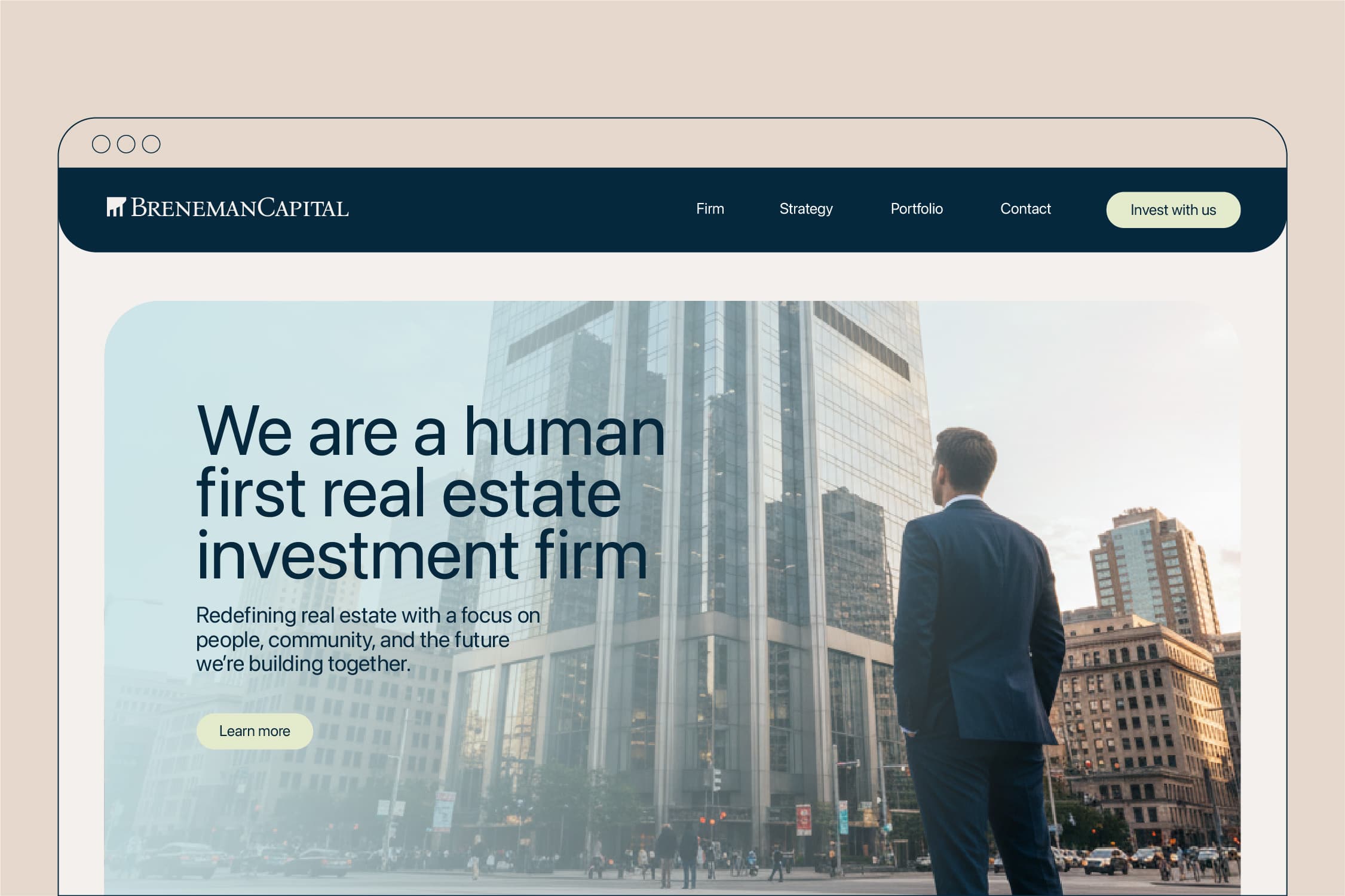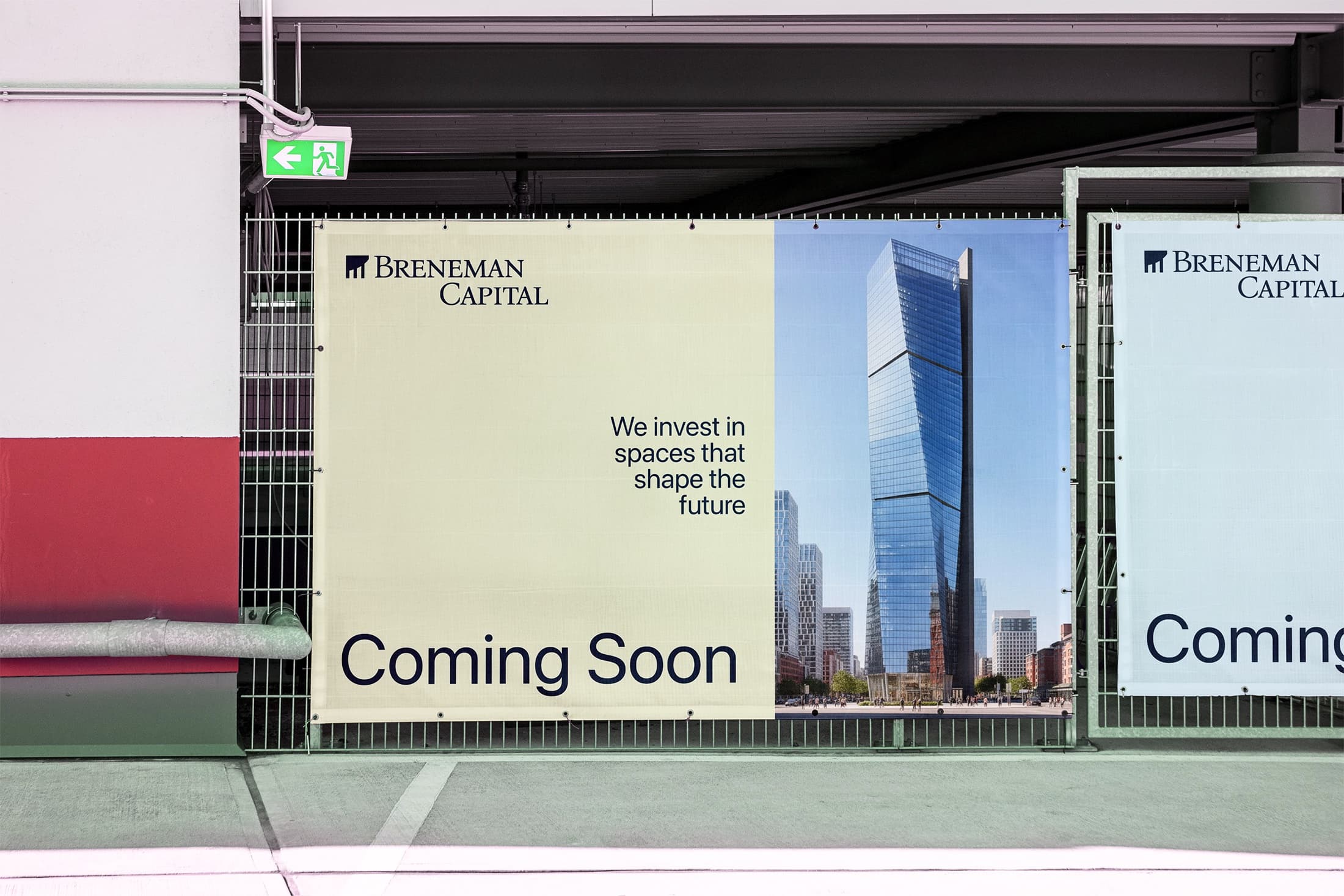

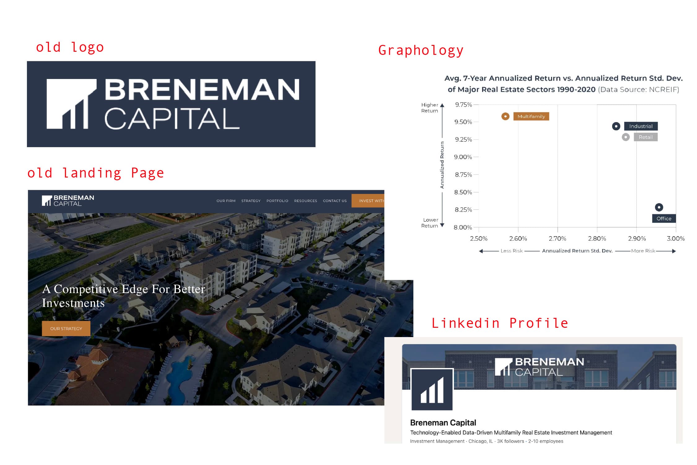
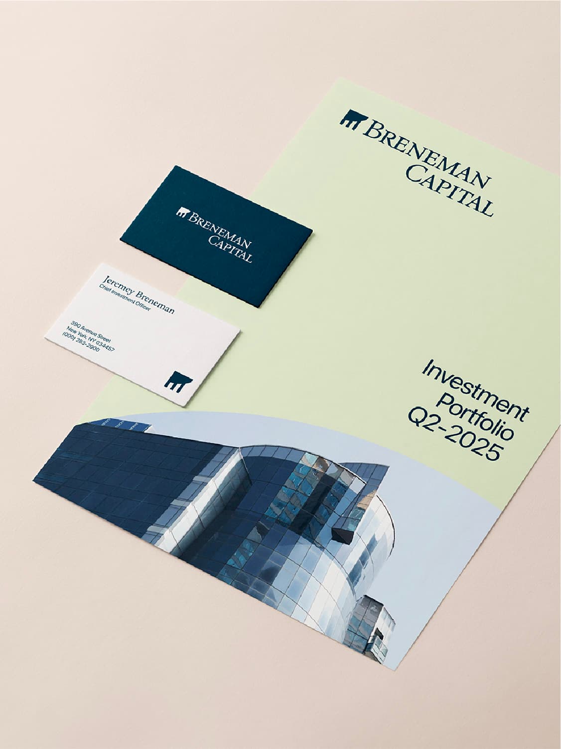
Breneman Capital has built a strong reputation over two decades of real estate investment success. However, its legacy identity no longer reflected the firm’s forward-thinking strategies or expanding portfolio. The brand had become indistinguishable from other major players—blending in with dull gray-blues, cliché golds, and a logo that felt more conventional than intentional. Its visuals lacked emotion, distinction, and clarity. This project set out to reimagine the brand identity, revitalize its marketing assets, and create a cohesive visual language that would resonate with a new generation of investors—one that restored prestige, inspired trust, and reflected the bold evolution of the Breneman name.
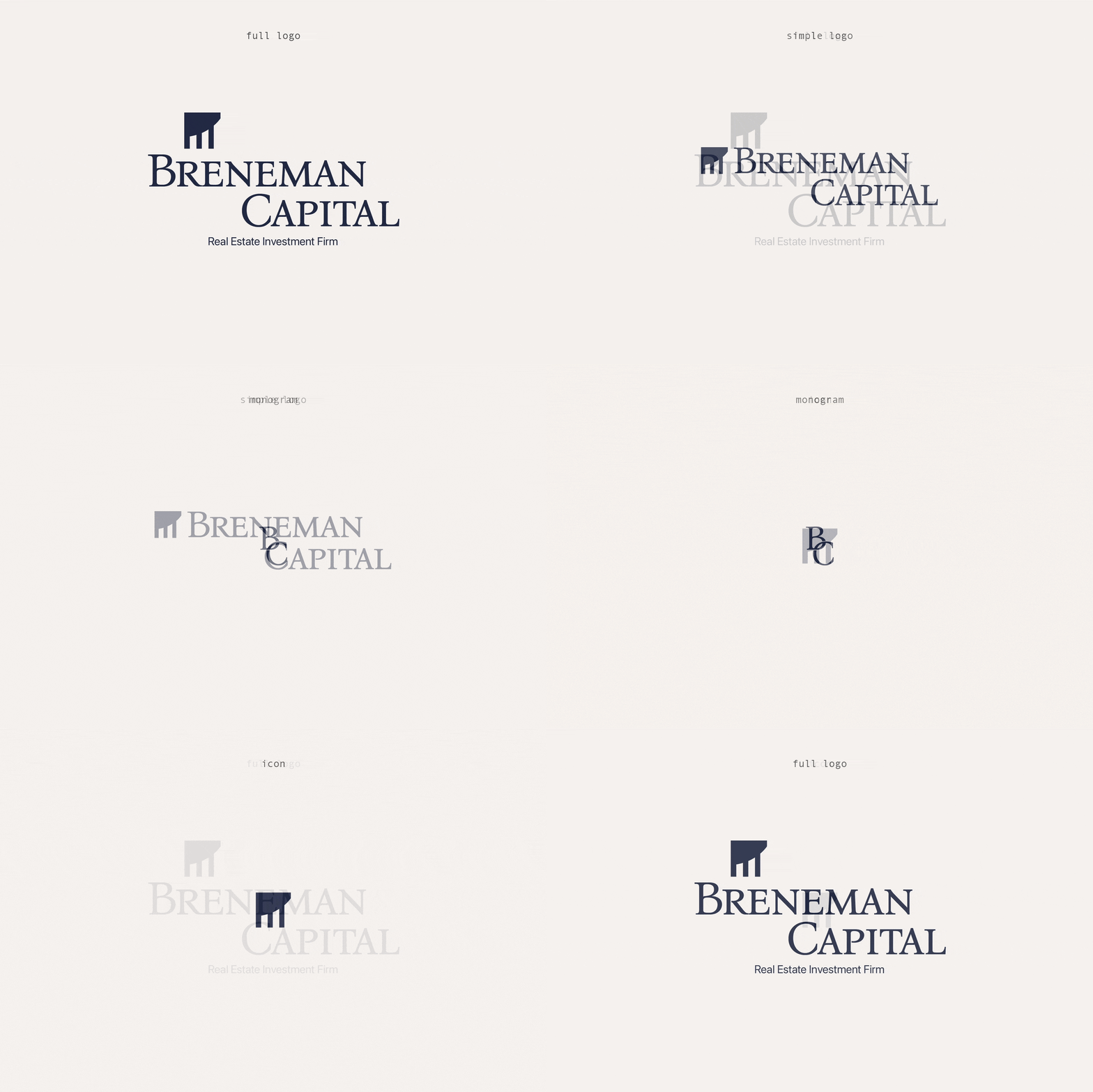
The new logo embodies authority, heritage, and trust. Its deliberate stacked structure symbolizes Breneman Capital’s commitment to building solid foundations that reach greater heights. A powerful serif typeface conveys strength and longevity — a statement that says, “we’re here to build.” Complementing it, a clean sans-serif font brings balance, ensuring the brand remains modern and professional. The renewed icon pays homage to its predecessor while fulfilling its evolution with deeper symbolism and intent. And the refined monogram preserves the prestige and legacy of the full logo, adapting seamlessly for smaller-scale applications.
The icon was meticulously reengineered to preserve the essence of the original while evolving it to reflect the new brand. Using the curve of the capital “B,” the rising pillars gain a subtle arc — symbolizing both the upward movement of real estate appreciation and Breneman’s core value of continually striving for greater heights. By inverting the pillar colors and leveraging negative space as the primary visual plane, the design forms a three-dimensional structure with window-like details — a direct nod to the real estate world and the firm’s commitment to growth and innovation.

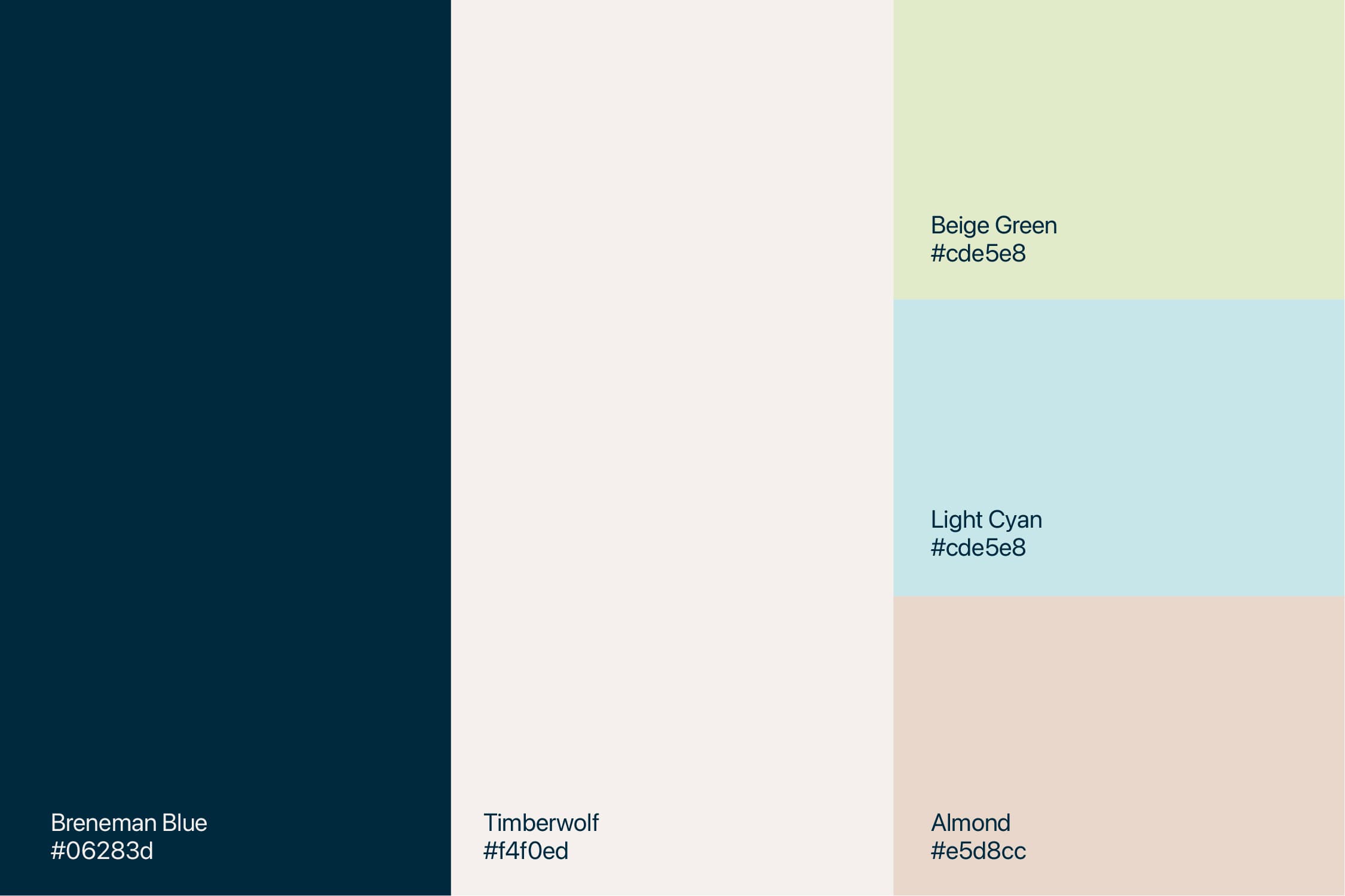
The color palette establishes a consistent look and feel that reflects Breneman’s mission of human-first investments. The soft pastel tones introduce warmth, approachability, and care — balancing perfectly with the bold, confident depth of the dark blue. Together, these colors communicate trust and competitiveness without losing humanity. This thoughtful blend not only appeals to discerning investors but also attracts team members who see Breneman as more than a company — they see a family.
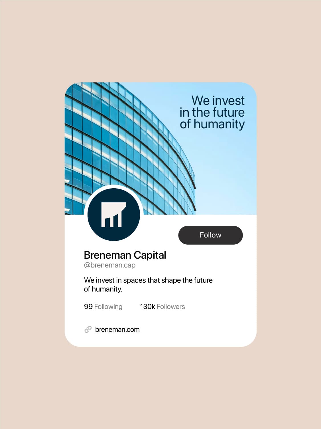
Our goal was to challenge the common perception of real estate as a purely profit-driven industry. We set out to reposition Breneman Capital as a human-first real estate firm — one focused on creating foundations that empower people to build the future. The copywriting strategy centered on genuine communication, speaking to people rather than just money-seeking firms. In terms of design, the softer colors and rounded corners throughout the website design make the firm feel more approachable, softening the experience and removing the sharp edges that might otherwise convey a sense of rigidity or inaccessibility.