
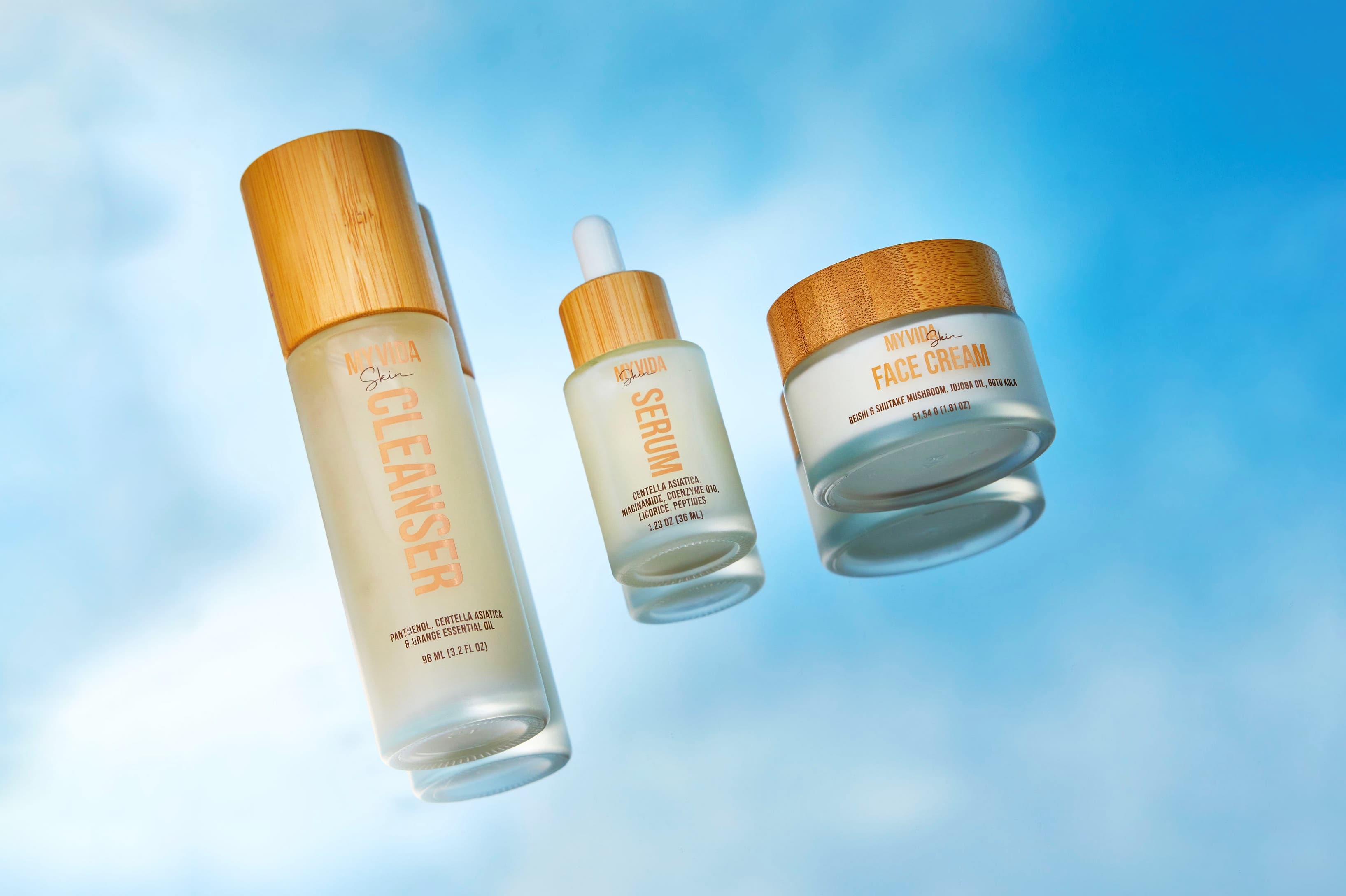
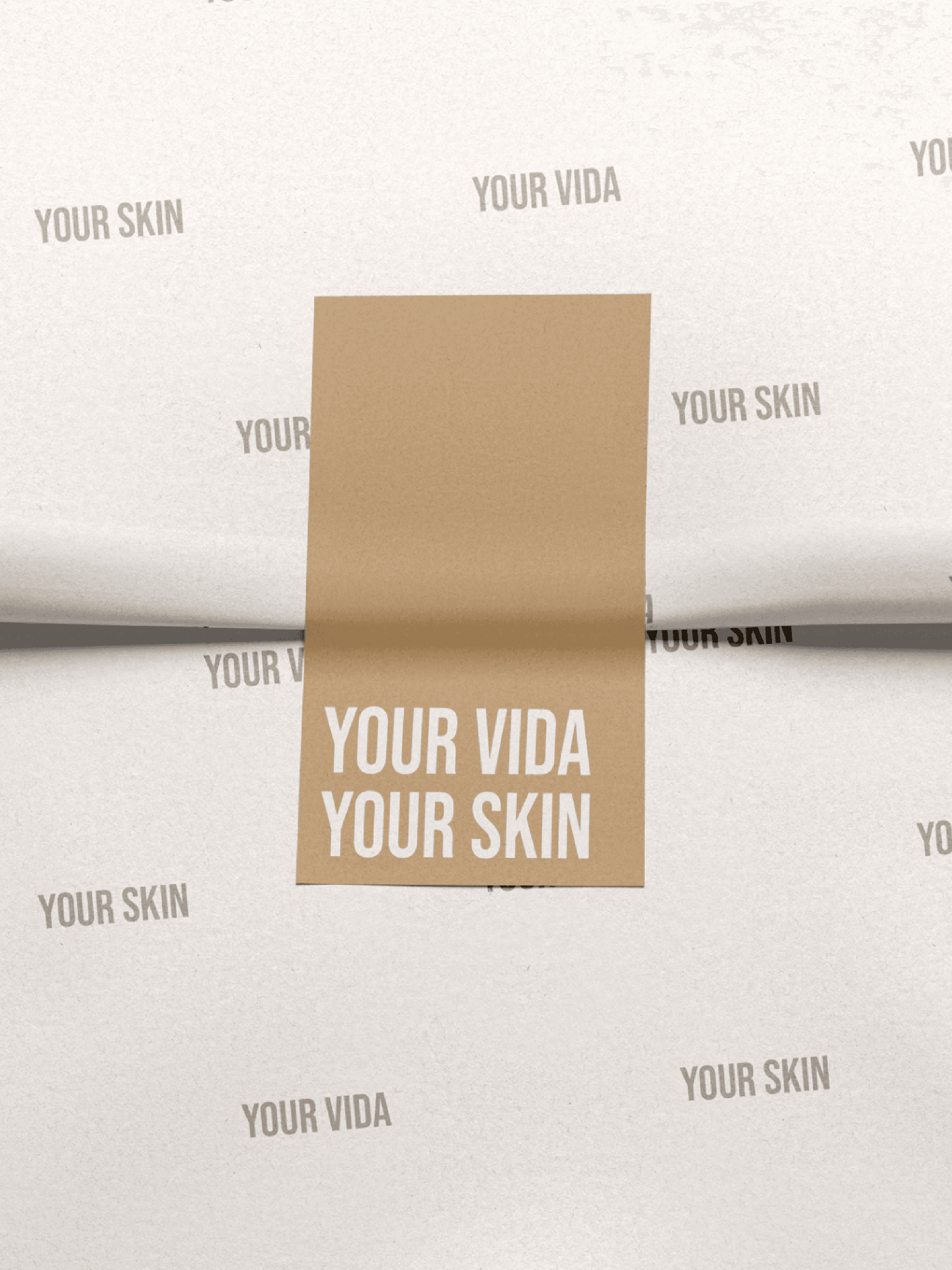
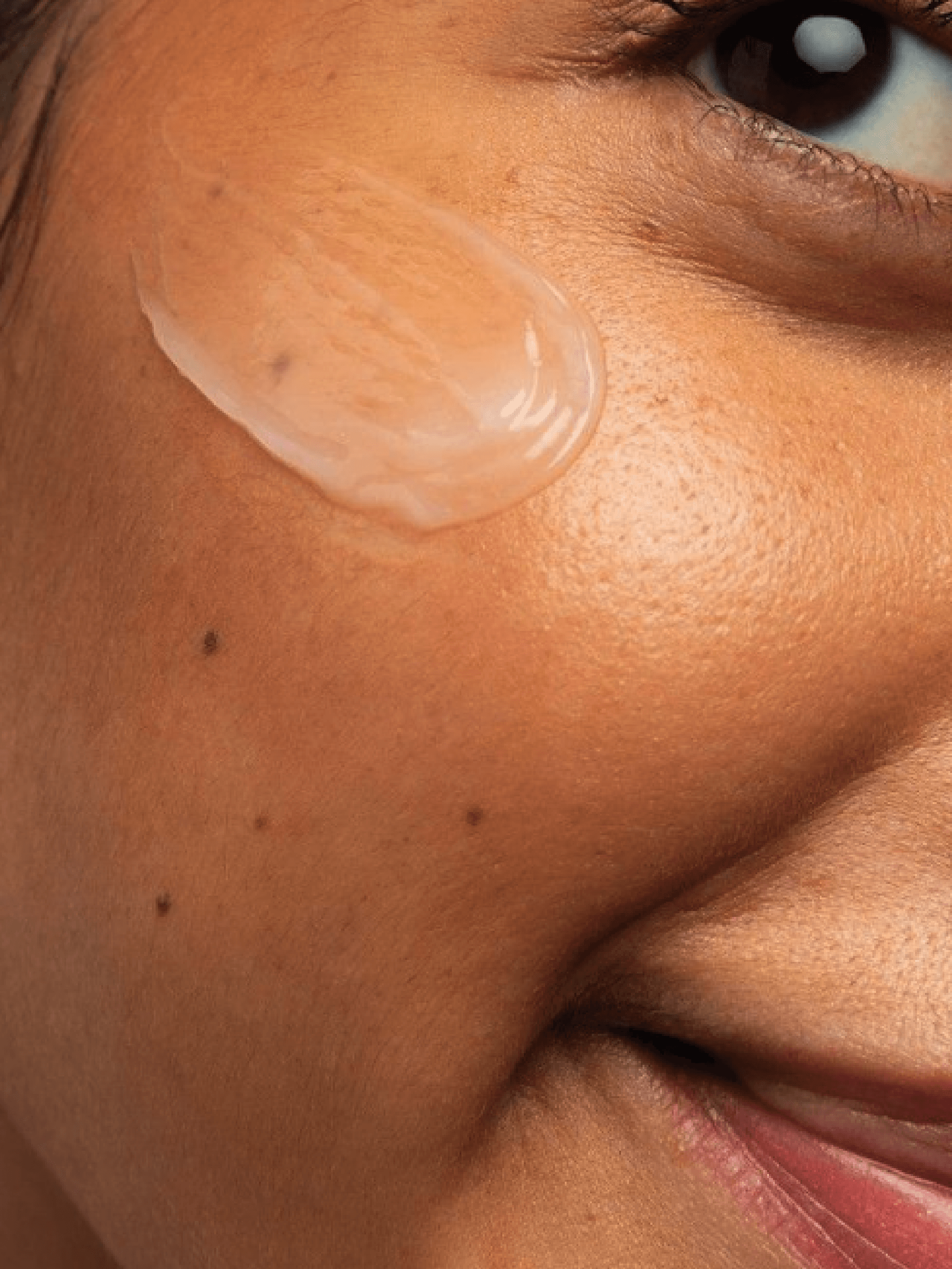
A returning client approached me with a bold vision to disrupt the cosmetic industry by creating a brand that reconnects people with their natural beauty through pure ingredients. From this idea, My Vida Skin was born—not just a cosmetic brand, but a statement of self-empowerment. We developed a brand identity centered around choice, confidence, and authenticity, with the slogan “My Vida, My Skin” reinforcing skincare as a personal decision. By using natural ingredients, My Vida Skin gives women the freedom to choose what’s best for their bodies without compromise.
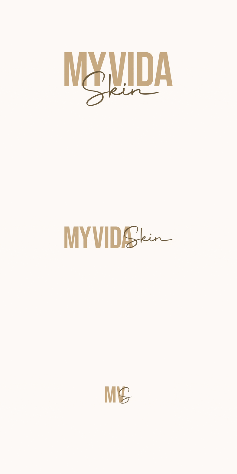
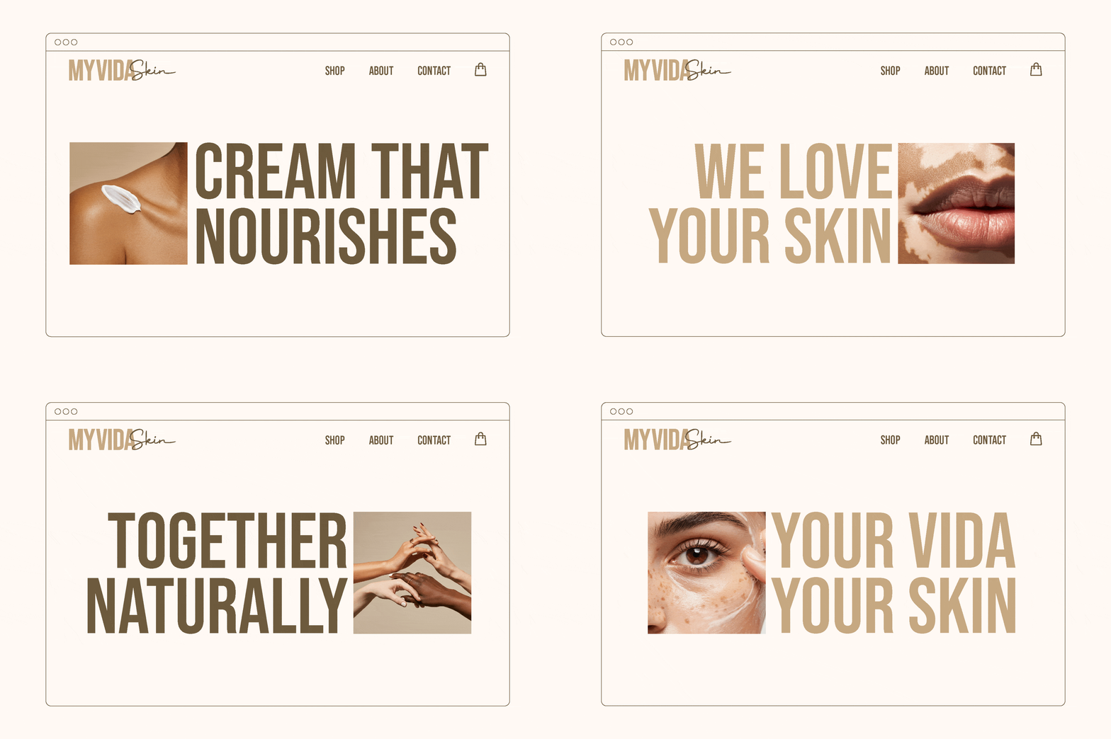
The brand identity reflects this vision with a bold yet inviting logo. A strong, modern typeface gives the brand confidence, while combined with a delicate script font adds a human, personal touch.
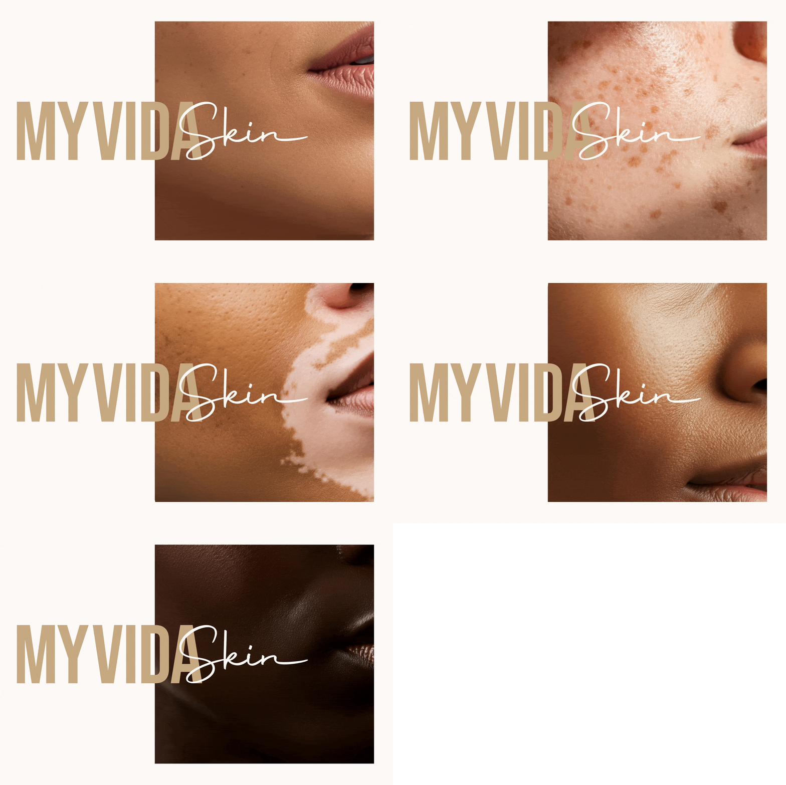

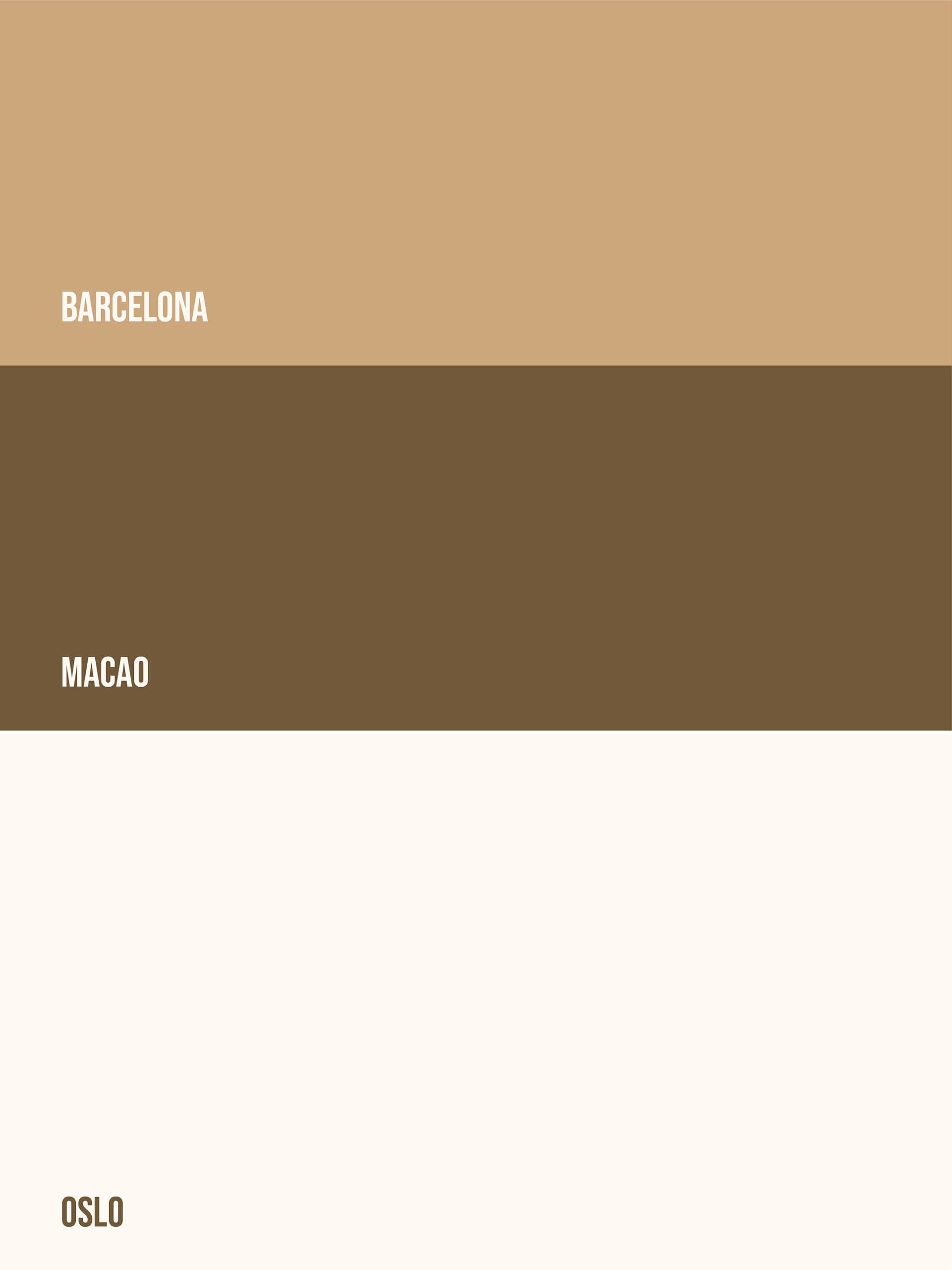
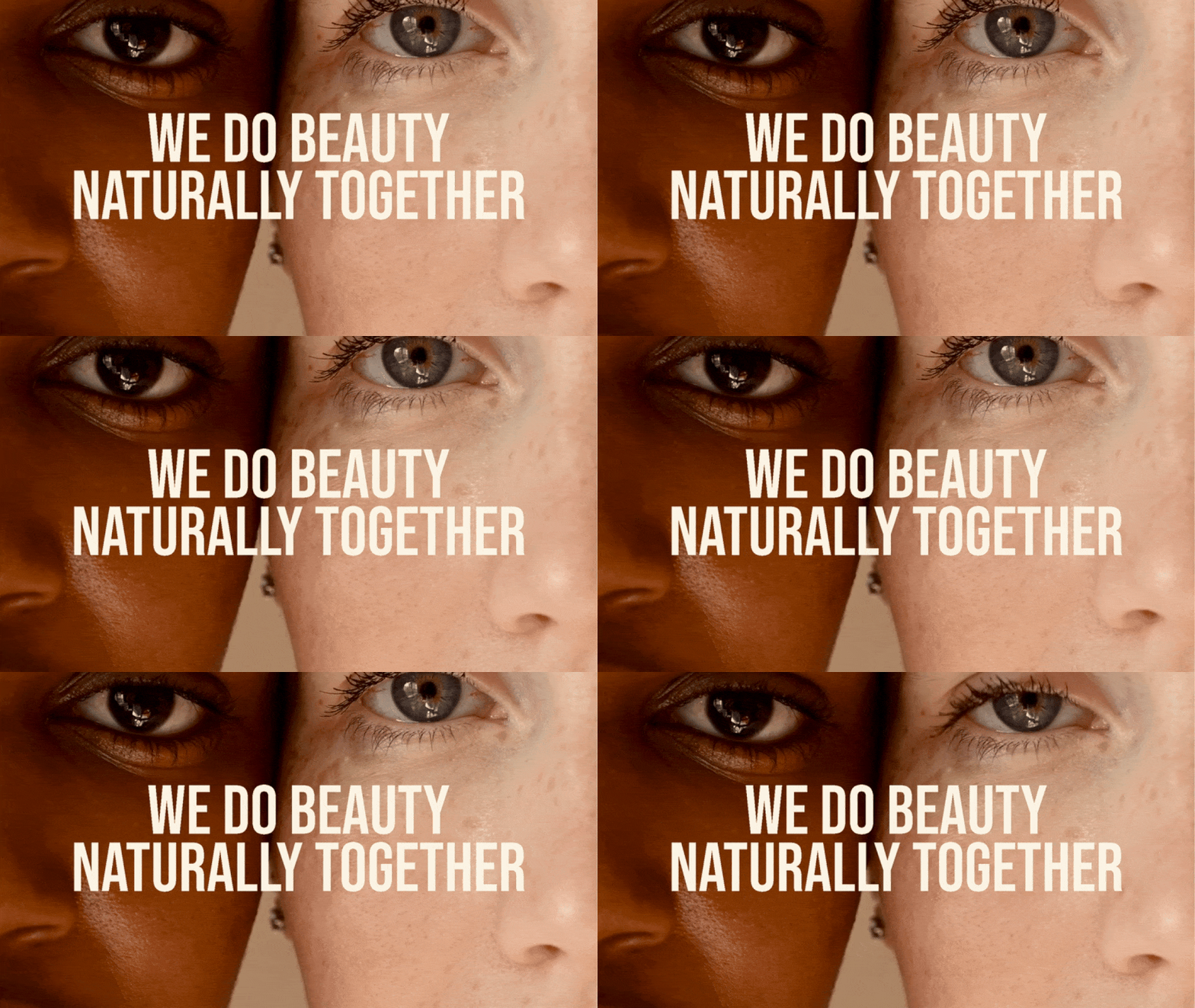
To further emphasize inclusivity and purity, we curated a neutral color palette that resonates with the authenticity of all skin tones.
The chosen typeface is a bold, cosmopolitan style font that communicates the union of the brand in a bold, unapologetic way–one that demands attention yet welcomes with familiarity.
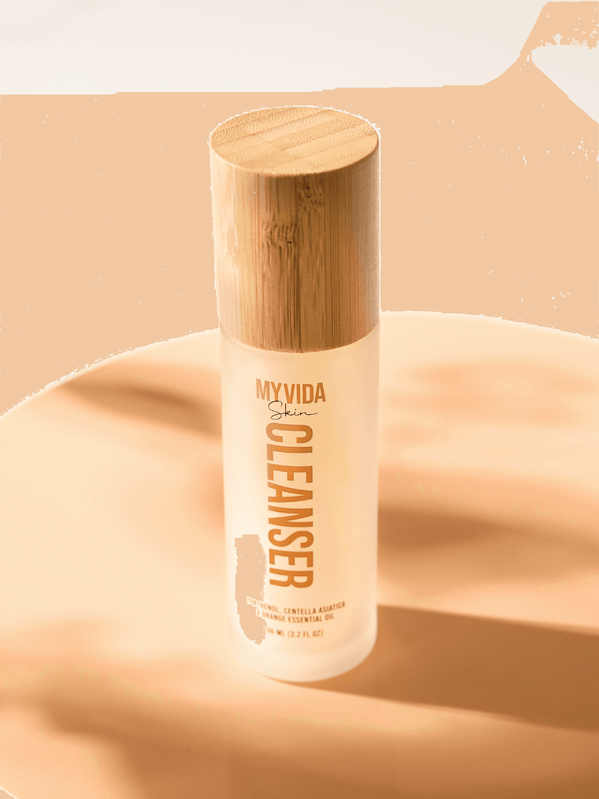
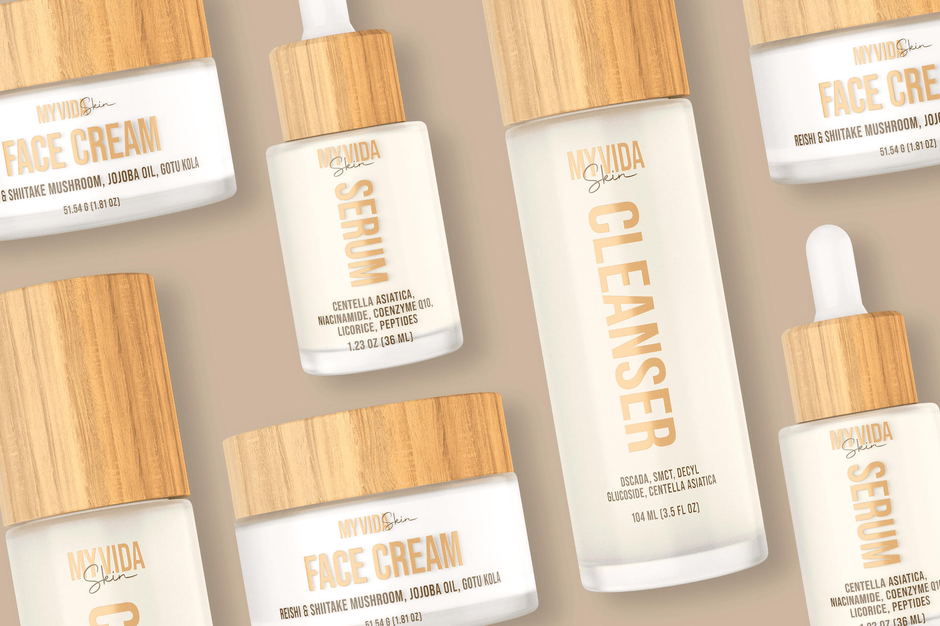
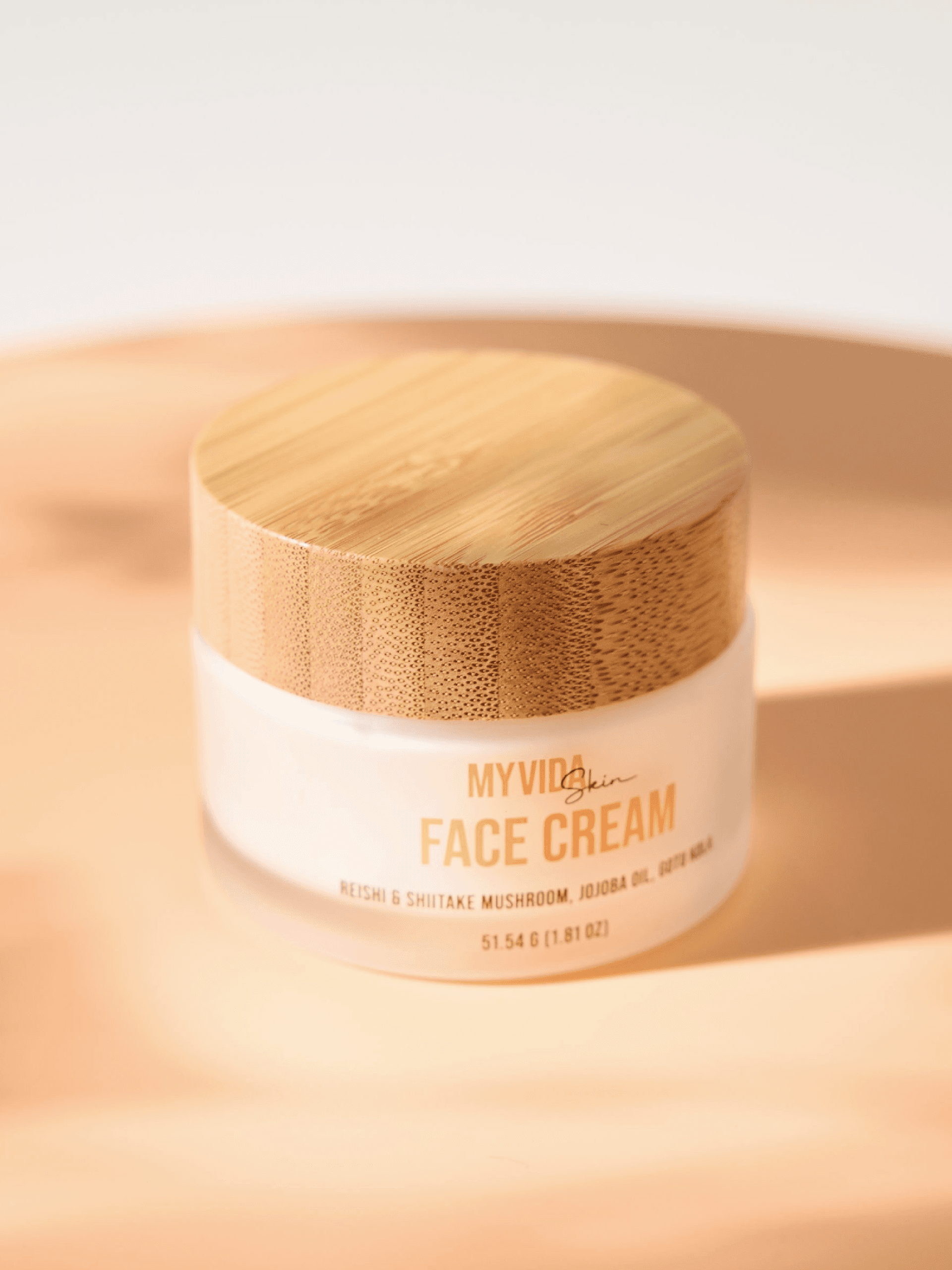
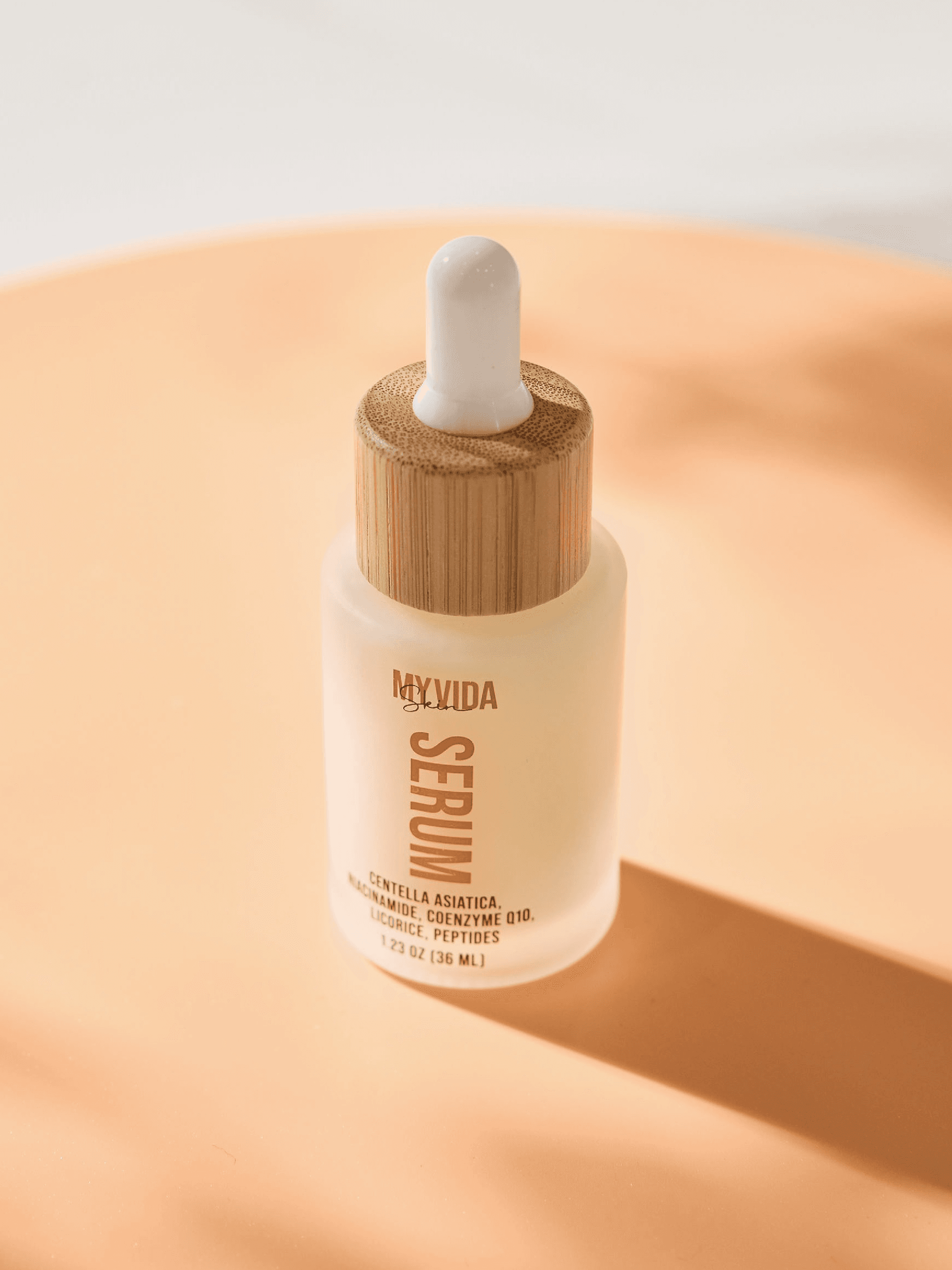
The packaging design was a unique decision as we stepped in as new players in such a competitive market. While many competitors leaned toward bright, oversaturated colors, we intentionally moved in the opposite direction to create a calmer, more authentic presence. To stay true to our brand’s natural essence, we selected bamboo lids — a material that visually and symbolically reinforces sustainability and purity. Paired with subtly glossy, transparent bottles, the design communicates both clarity and honesty, perfectly reflecting My Vida Skin’s commitment to natural beauty and transparency.